Material Web Playground
Components

Badge
A small value indicator that can be overlaid on another object.

Button
An interactive button with a range of presentation options.

Checkbox
Captures boolean input with an optional indeterminate mode.

Chips
Presents a list of items as a set of small, tactile entities.

Dialog
A configurable modal that displays dynamic content.

Divider
A vertical or horizontal visual divider.
Icon
Renders a specified icon.

List
Presents conventional lists of items.

Menu
A floating panel of nestable options.
Navigation bar
Navigation drawer
Navigation tab

Radio
Allows the user to select one option from a group.

Select
Allows the user to select one or more options using a dropdown.

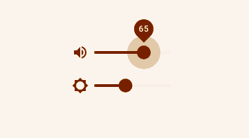
Slider
Allows the user to input a value by dragging along a slider.

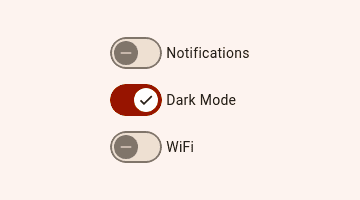
Switch
Captures boolean values as a clickable and draggable switch.

Text field
Wraps input fields so they are displayed consistently.